
Thinking made visible
Identity work at Mispronounced is shaped through how things are used — across environments, materials and moments of interaction.
Projects move between developing new visual systems and working within existing ones, refining how brands are expressed across physical, motion and digital touchpoints. Rather than being defined in isolation, identity is developed alongside other visual outputs, allowing it to evolve consistently.
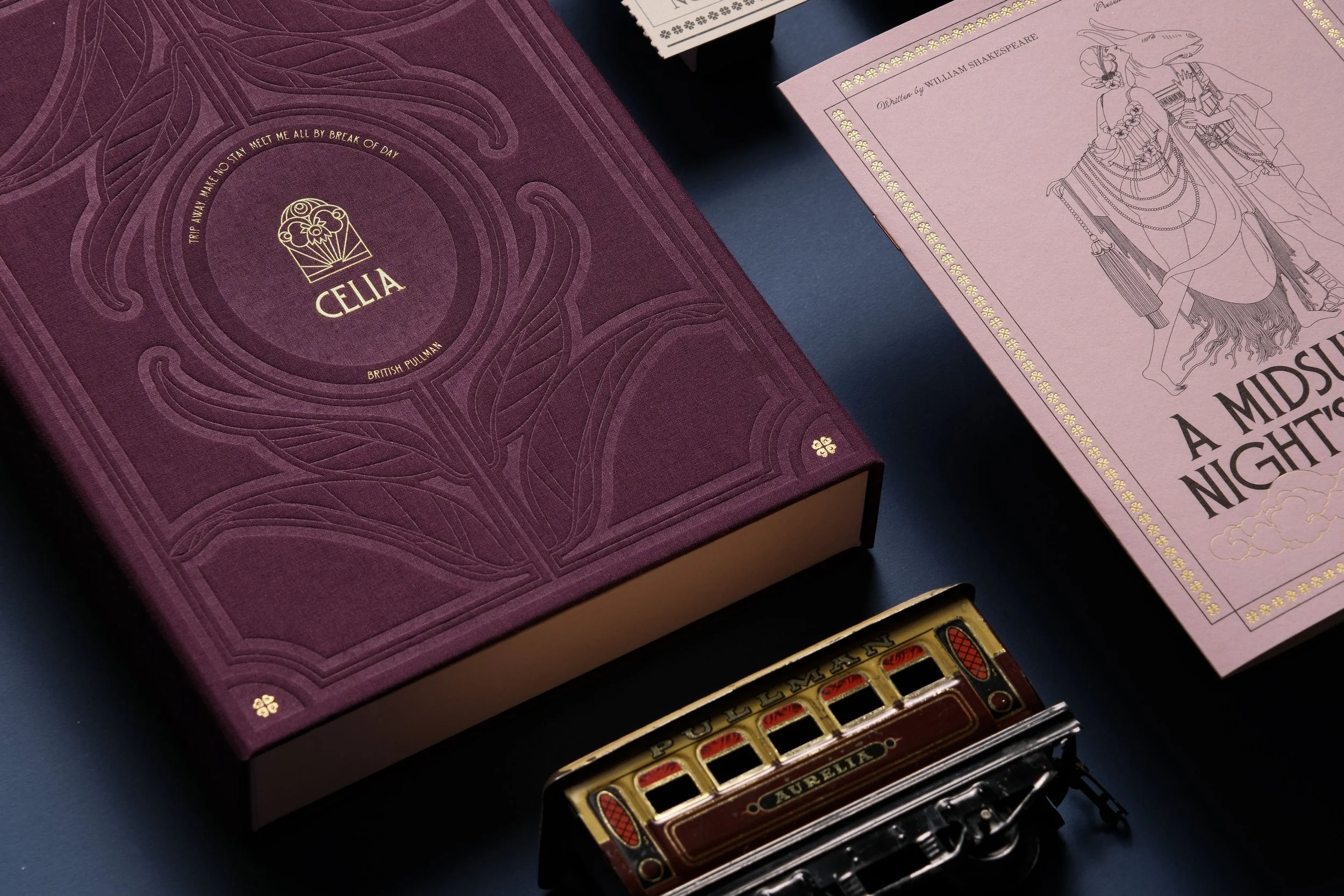
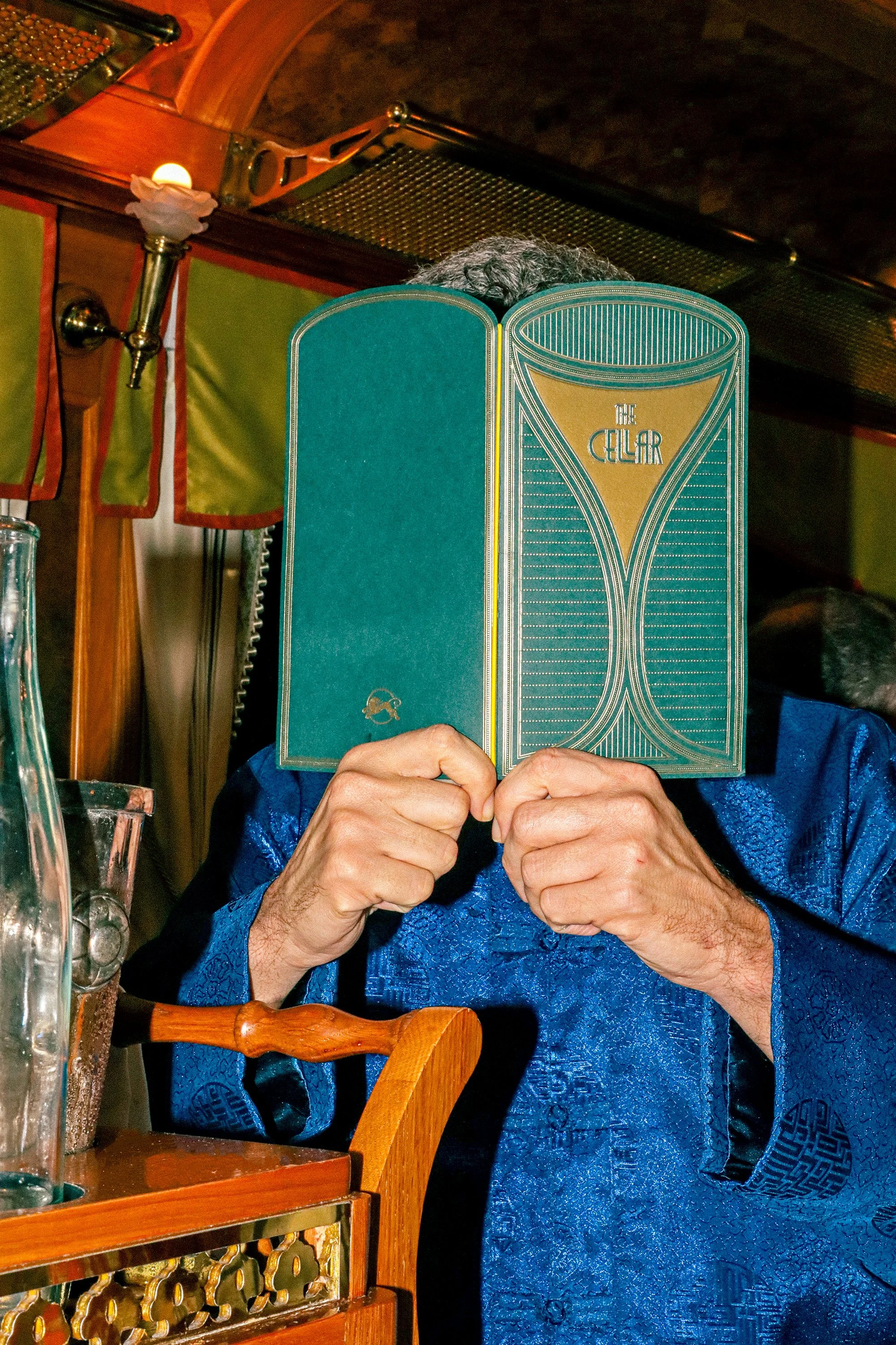
Work spans visual systems, sub-brands and the refinement of existing identities across print, digital and spatial outputs — including publications, printed materials and on-site touchpoints.
These are often the areas where design is encountered most directly, so decisions are shaped by use. Materials, typography and layout are considered in context, with clarity and consistency in mind.

Identity is approached as a framework rather than a fixed set of elements, allowing it to adapt across formats, scales and environments without losing clarity.
Projects often continue beyond initial delivery, evolving to support new campaigns, locations or operational needs.


New project,
New perspective
Whether shaping a new visual language or capturing an existing one, we welcome conversations with brands seeking thoughtful creative partnership.