
A new thread through Royal Scotsman

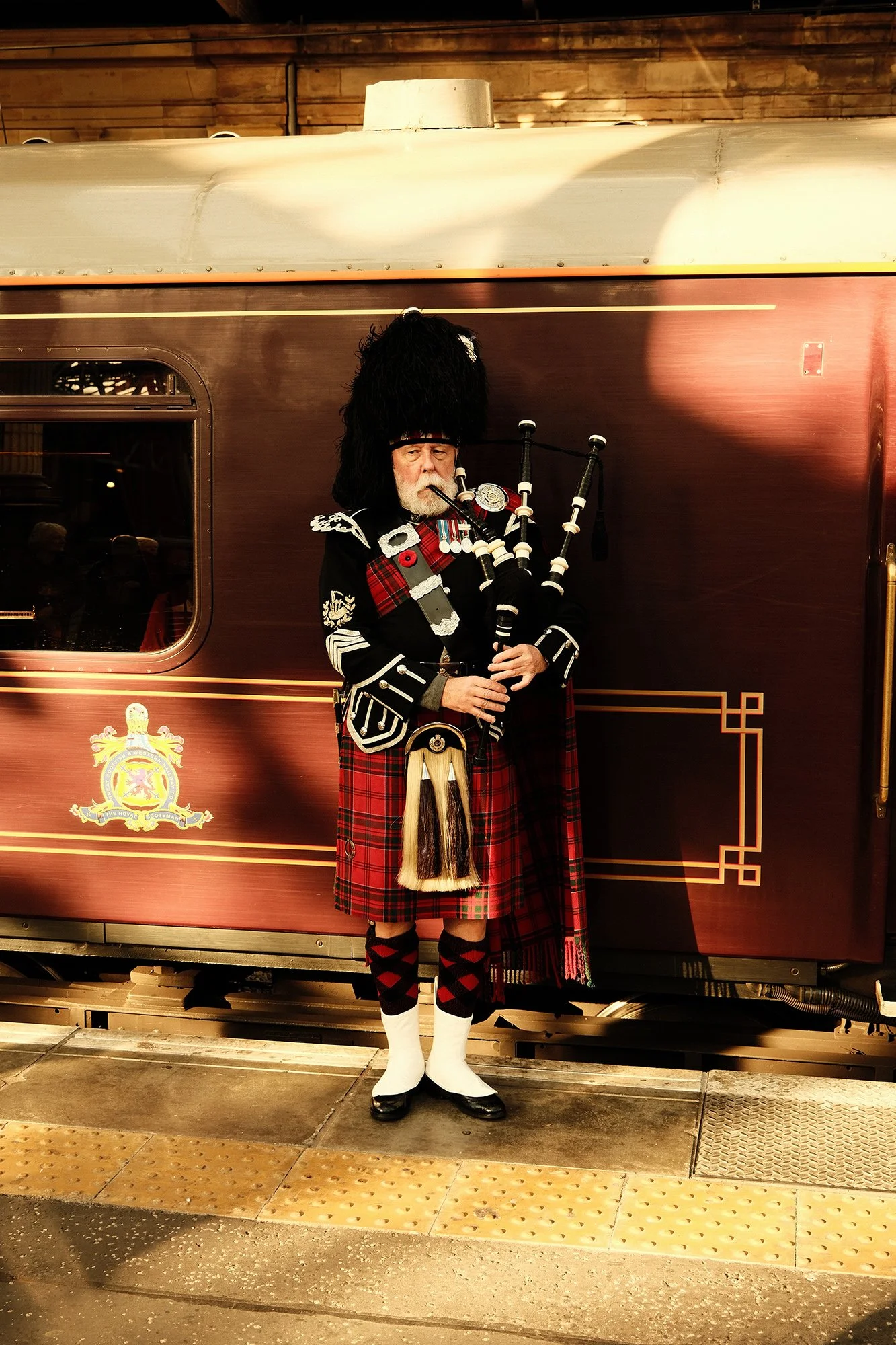
One of the things that becomes apparent quite quickly aboard Royal Scotsman is how much of its character sits in the details.
It has the feeling of somewhere that just happens to move. Dark timber, tartan, framed artwork, polished brass and intricate marquetry run through the carriages, alongside newer spaces such as the Grand Suites, where Scottish landscape, textiles and tradition have been interpreted in a way that feels more celebratory than nostalgic.
Time spent photographing and working aboard the train made those details a natural starting point for developing a new direction for its onboard collateral.



Looking beyond
the obvious
Scotland comes with a very recognisable visual language. Thistles, heritage motifs and familiar patterns are difficult to separate from it, but using them too literally can quickly become predictable.
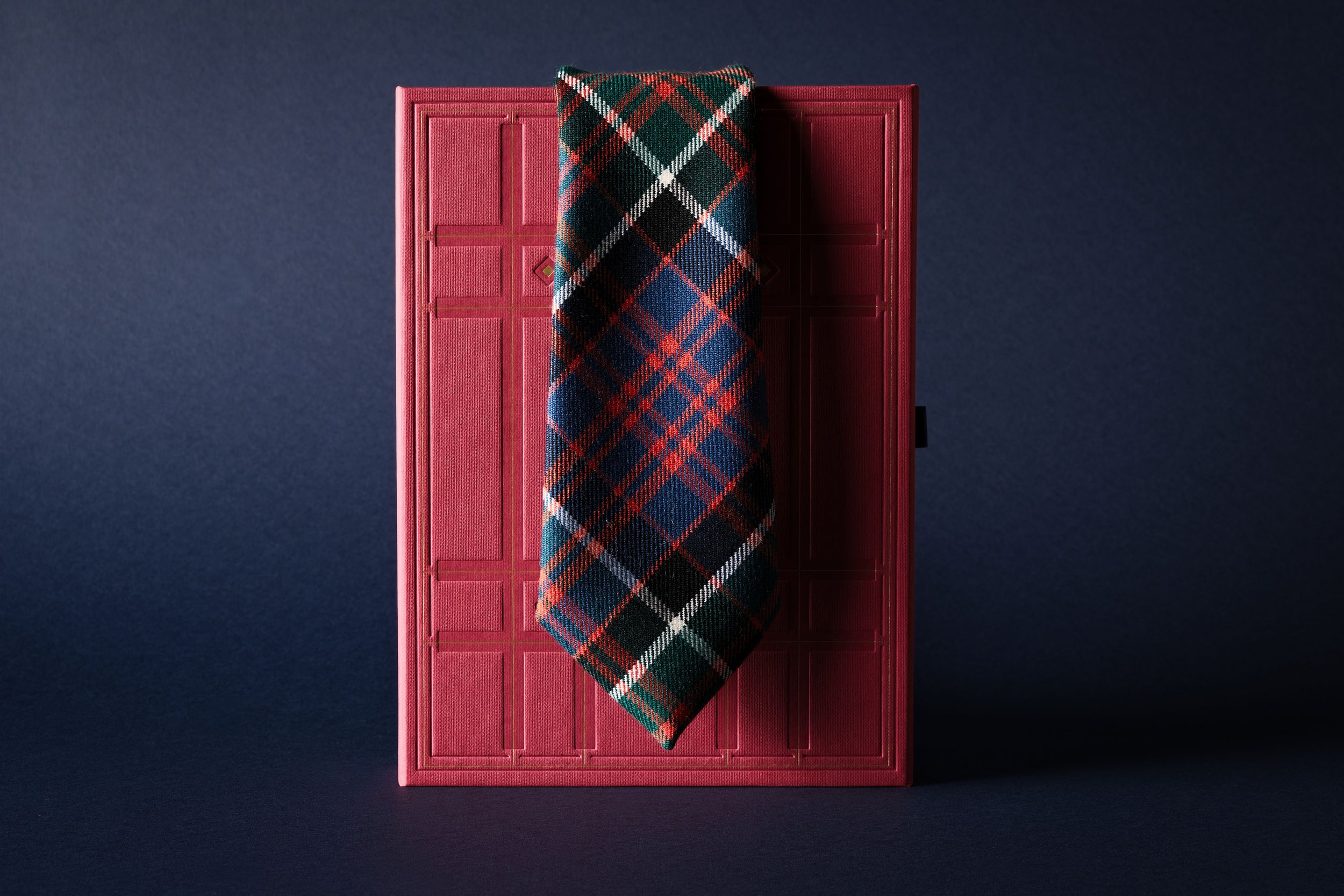
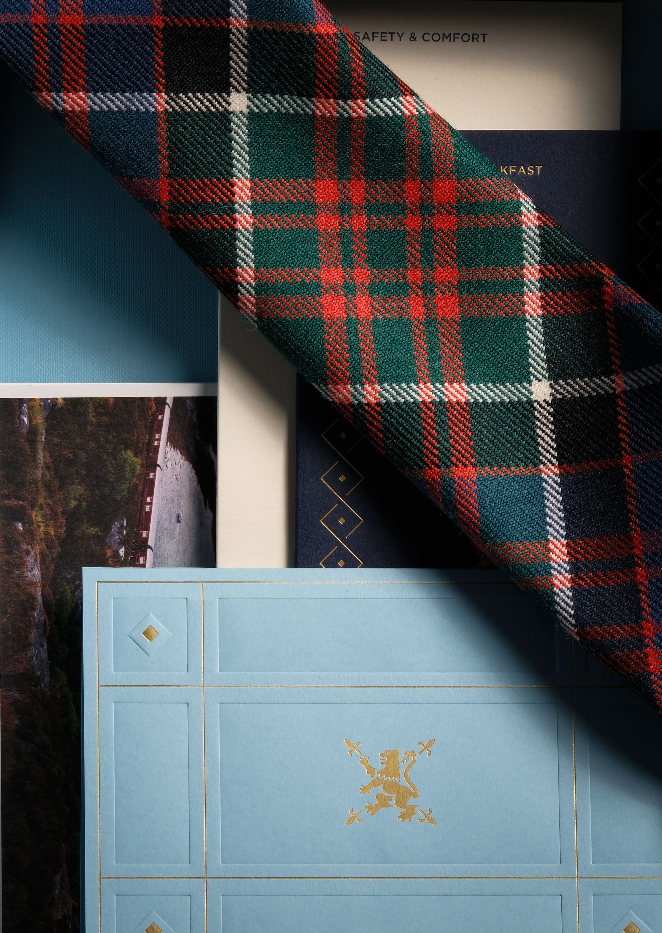
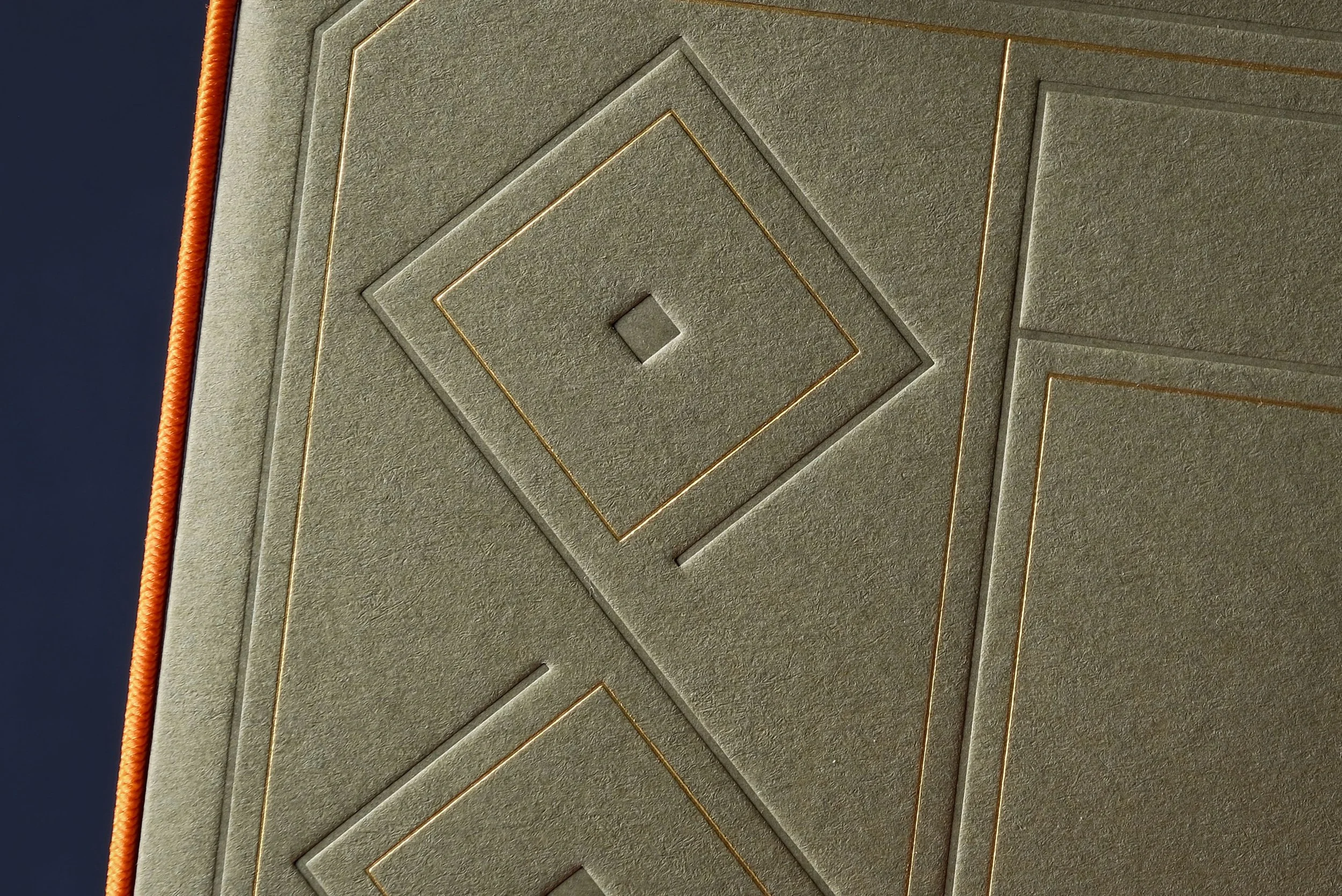
Tartan became one of the main starting points, not as a pattern to reproduce, but as a structure: intersecting lines, blocks of colour, changes in scale and moments where different sections cut through one another.
Alongside the details found around the train, it became the basis for a graphic language that felt familiar without simply repeating what was already there.
Colour, texture and print
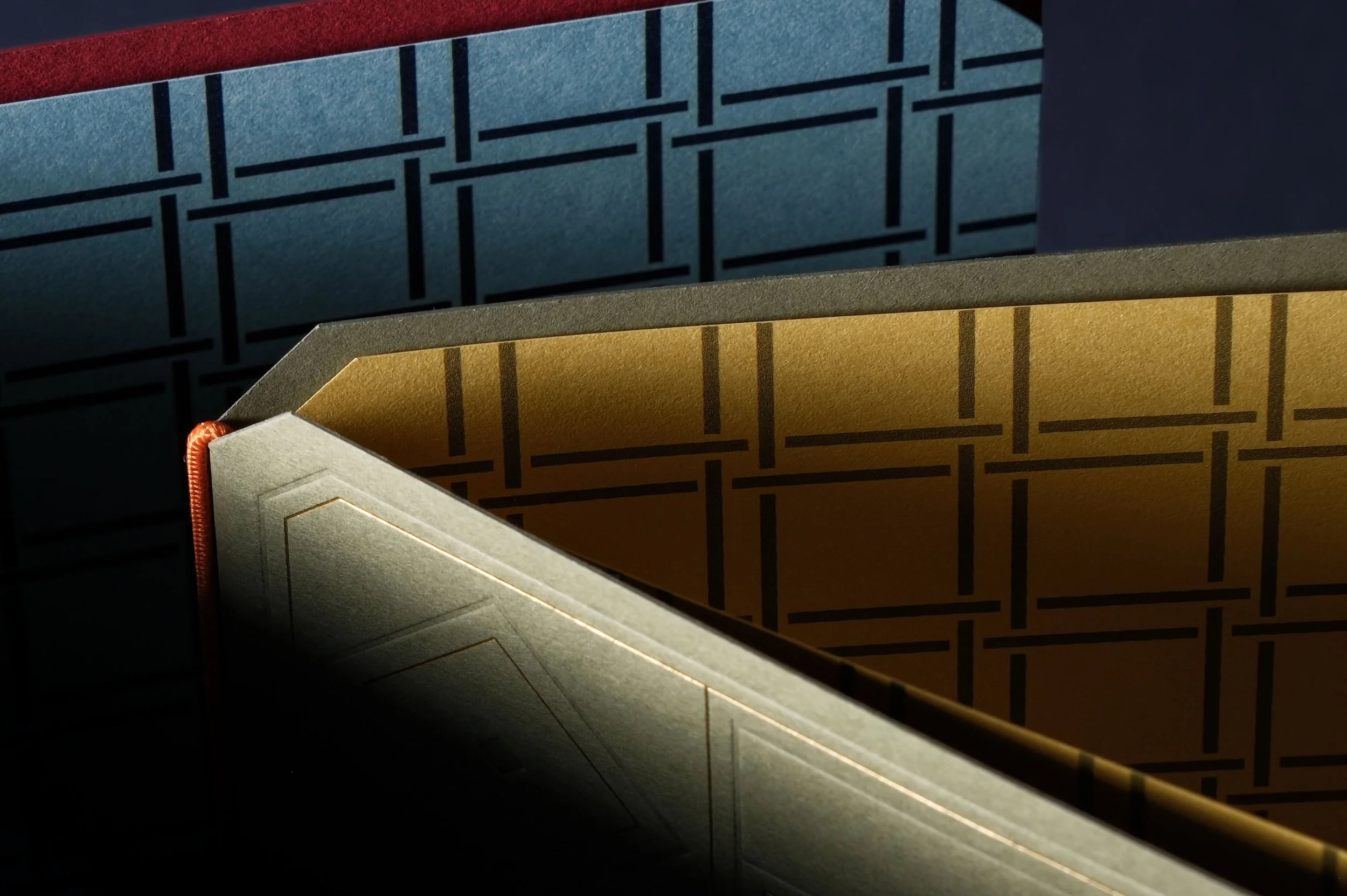
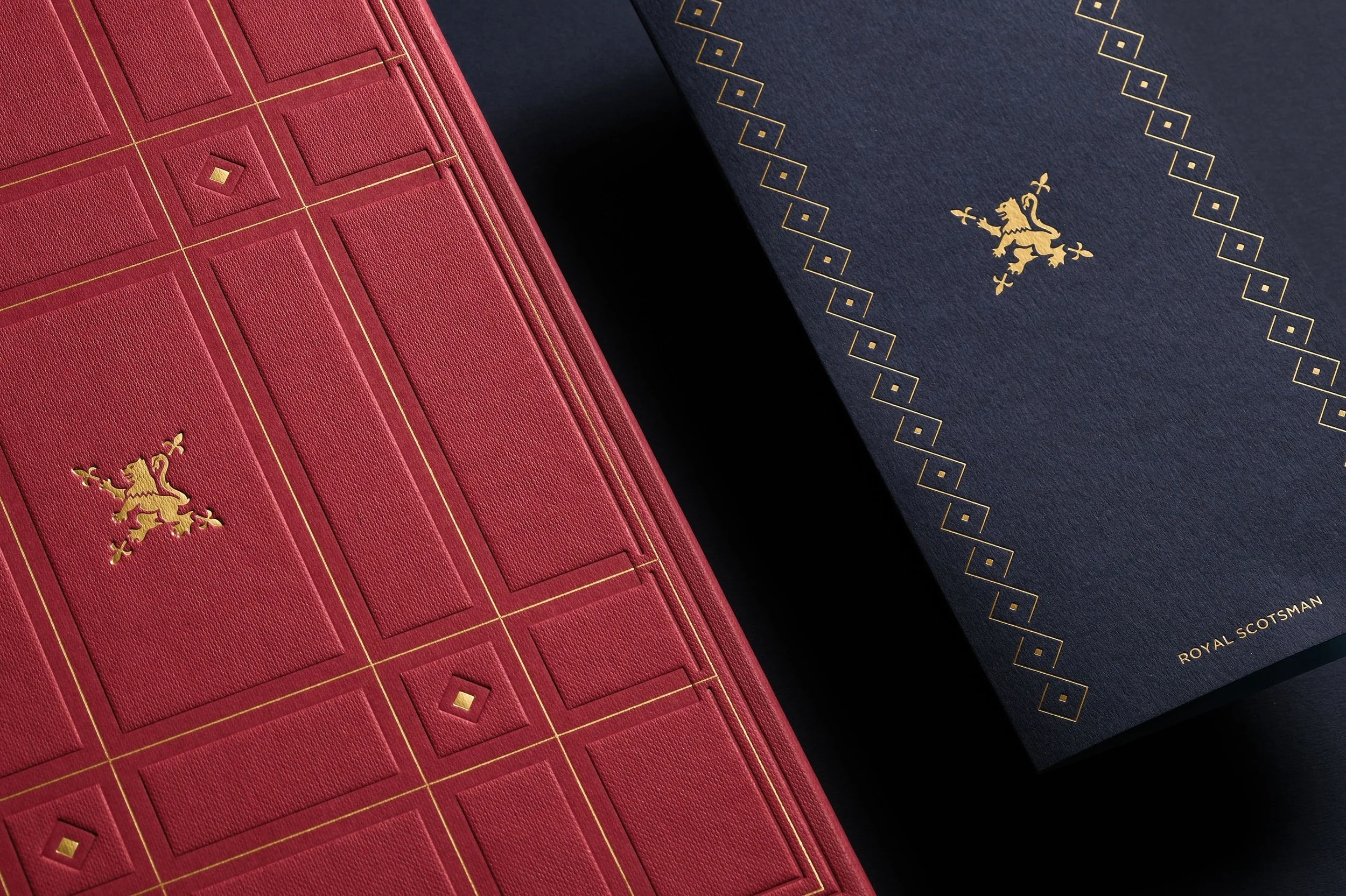
Colour provided another connection back to the train. A muted red takes its cue from Royal Scotsman’s exterior, paired with a deep navy and a brighter blue that brings more energy into the palette.
That same balance continues through the materials. Colorplan and Fedrigoni papers sit alongside embossing and foil finishes, with linen-like textures creating another subtle connection to the textiles found throughout the carriages.
These pieces are picked up in cabins, placed beside timber and fabric, used over dinner and handled throughout the journey. The aim was for them to feel naturally part of that environment.


A thread that
can continue
With the first phase covering onboard collateral and menu systems, it was important that the direction had somewhere else to go.
Graphics, colours, typography and materials create a flexible visual language that can move between different touchpoints without requiring every piece to look the same.
That will continue into future work, including Royal Scotsman’s wider off-board experience. Before guests even reach the platform, those touchpoints can begin to introduce something of the world they are about to enter, allowing the same visual language to exist both onboard and beyond the train.
What I like most about the finished direction is that none of those references really need to be explained.
Sitting in a cabin, you might notice a pattern that feels familiar, a colour appearing elsewhere in the carriage or a texture that relates to something beside you. The relationship can remain fairly quiet.
It is not about reinventing Royal Scotsman. It is about taking some of the things that already give the train its character and allowing them to run as a new thread through the experience.
